Film Noir
We are going to change the performance parts of our music video and make them black and white in the same style as film noir. Here are some examples of film noir films:


Film Noir
We are going to change the performance parts of our music video and make them black and white in the same style as film noir. Here are some examples of film noir films:


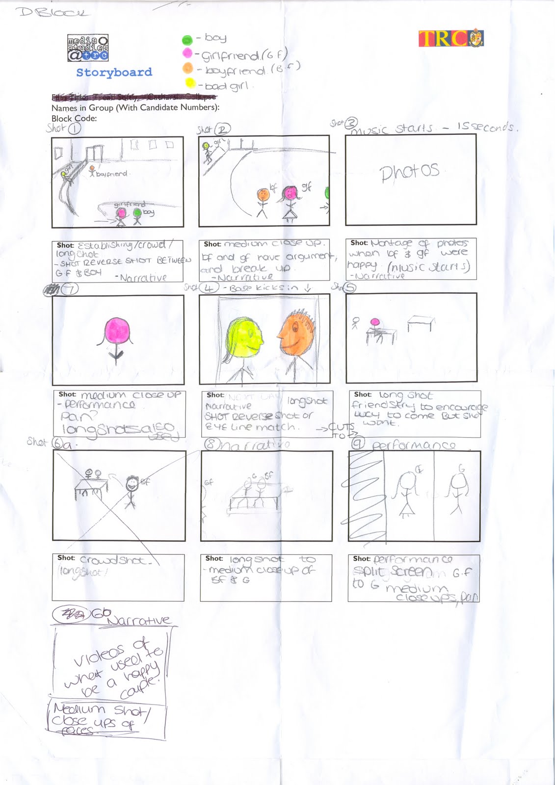


These are the storyboards we created to help with the production of our music video. We have drawn rough drawings to show what should be happening in each scene. We will probably find that our final video will not completely match our storyboard but it will be a rough guide to what we are aiming to have in our video and in what order the video will go in.
We have used a number of different fonts and effect to design a logo for our band name 'The Veronicas'. We will use audience feedback to decide which one we should use for our album cover. We designed them on PhotoShop Elements which is the programme we will use to design our ancillary tasks. This is the first of our designs; we have used black and purple because the black shows the rock element about the song and the pink gives it the feminine look. The font itself gives the band name a rock look as it is big and bold.
 This is our second design for our band name; we have used a clear, readable font which is black with tiny little sparkles on which makes it look feminine. The lips are an idea we used off the original cover and this also makes it look feminine. The colours contrast so that the audience can still read the band name clearly.
 Our third design is done in big bold letters which make it stand out and makes it easy to read. The colours used are feminine. The drop shadow which has been used makes it stand out more as the font doesn't have much of an outline.
This was the forth design for our CD album cover. This followed the colour themes we had used in the other three designs. I liked how it looks like it has glitter on it. It might look better if it was a bit bolder and the text was bigger.
From our audience feedback we have decided to use design one as most people thought it was the best design as it portrayed the genre of music in the best way.


This is the front of college, we could use this at the start of our video. This will be used for some of the narrative part of the video where the boyfriend and girlfriend are having an argument. It will be good to use at it will show that most of the narrative in the video is set in and around college.
Again this location would be used in the narrative part of the video. This place could be used to show when the girlfirend sees her boyfriend with another girl and could also show her being lonely.
Part of the narrative is set in a classroom and this is just an example of a classroom in college.
Here are some photos of locations we have looked at to use in our video for the narrative aspect of the video.
This is our treatment for the production of our music video.


We have written this letter to EMI to ask permission to use their song by The Veronicas for our final major project.
Thomas Rotherham College,
Moorgate Road,
Rotherham,
S60 2BE.
Dear Jonathan Channon,
We are students at Thomas Rotherham College currently studying Media. For our A-level coursework we will be recreating a music video and would like to use ‘The Veronicas – Untouched’ for our project.
The video will be purely for educational purposes and will not be used for broadcast. It will be viewed by our class mates, teachers, parents and the exam board when the coursework is submitted.
All of the song writing and publishing credits will be acknowledged, but we hope it is ok for us to use the song.
If any issues arise from this, please let me know. Please contact our teacher James Finlayson at the above address.
Yours
Emma Huggins, Lucy Farrell and Frances McGrother
TRC Students.
This is the script for our musci video which will be used at the very beginning of the video before the music even starts.


This is the presentation that we showed to the class. It shows all of our ideas. We have made it into a video by using CamStudio.


We looked at three different ideas for songs we could use for our project. We wrote about each of the ideas looking at props, locations and the purpose of each.

I looked at this video because it had generic codes and conventions of a.... RnB video. The women in it is objectified (Laura Mulvey - The Male Gaze, shows women to be objectified for men to look at).
Kelly Clarkson - My Life Would Suck Without You!
The music video for Kelly Clarkson’s hit single My Life Would Suck Without You follows the generic codes and conventions of a music video for a pop video but it also uses ideas from rock music videos. She has used some of these ideas in some of her other videos.
As Stuart Hall (1980) suggested the audience are positioned to get a preferred reading of how they want the audience understand the video, this reading can depend on a person’s social background and beliefs. Mise-en-scene, camerawork, editing and sound are used to do this.
The story within the video is about a couple (Kelly Clarkson and a man) who have known each other since they were younger and are now in a relationship, the video looks at all the good memories of their relationship. The video is 50 percent narrative and 50 percent performance. Performances are usually seen in rock videos and not as much in pop videos.
Mise-en-scene is used to create verisimilitude of the diegetic world of which the video is set in. At the start of the video two young children playing together in a small park with climbing frames because stereotypically children love playing in parks with their friends. Props used in the video make the settings seem more realistic to the audience. The bracelet that is on the young girl is then shown on Kelly Clarkson to show it is the same person. In the flat which is a typical American flat which we see on TV on programmes is made to look more homely by having certain items in such as; a sofa, a goldfish in a bowl, a lamp, a picture on the wall, a dining table and a laptop, which most people have in their homes. In the car she uses a mobile phone, this shows they are young. Costumes are used in the video to help create a ‘rock chick’ look because when it is in the performance she is wearing leather looking bottoms and a black jacket, which is associated with rock music. When she is with her boyfriend both she and him are wearing casual clothes, jeans and a t-shirt. In one scene she is seen to be wearing a man’s shirt, it is often thought that women like to wear their partner’s clothes. At the beginning when the young children are playing in the park the girl is wearing a top, a skirt and long socks, she is wearing a skirt as it is feminine to show she is a girl. The boy is wearing a jumper and jeans.
The lighting in the video for the performance is dark with really bright lights. The bright lights connote happiness and love. The dark connotes anger which goes with the words of the song as she would be angry if she wasn’t with that man. In the narrative part of the video uses really bright lights. Whilst she is on the swing the colours are really dark which connotes sadness, which shows what she would be like if she was too lose him.
Camerawork is used to create a variety of effects. Medium close ups are a lot whilst she is singing parts of the song; this is to show the emotion on her face. This is a code and convention of any music video apart from ones that are all narrative which sometimes don’t even have the artist in. At the beginning of the video there is a long shot of the two children playing together in the park, this is to show the audience what they are doing and where they are. They use a high angled establishing shot of the block of flats; this is because it shows the audience where they are but also that they are in .jpg) one of the flats near the top of the building. Whilst in the flat a long shot is used to show more of the flat and so it is clear they are running after each other around the table. In the performance part of the video an establishing shot is used the first time they appear in the video to show all of the people and their instruments. During the performance parts of the video there is a lot of zooming in to Kelly Clarkson’s as she is the main person in the video as she is the singer, this also uses the rule of thirds to show this as she is always in the middle in the performance shots. When they are in the car over the shoulder shots are used to the audience can see them talking to each other and so it is clear that there are two people in the same car.
one of the flats near the top of the building. Whilst in the flat a long shot is used to show more of the flat and so it is clear they are running after each other around the table. In the performance part of the video an establishing shot is used the first time they appear in the video to show all of the people and their instruments. During the performance parts of the video there is a lot of zooming in to Kelly Clarkson’s as she is the main person in the video as she is the singer, this also uses the rule of thirds to show this as she is always in the middle in the performance shots. When they are in the car over the shoulder shots are used to the audience can see them talking to each other and so it is clear that there are two people in the same car.
Editing is used to help the audience understand the narrative; it is also used to cut between the performance and the narrative. Continuity editing is used in the performance as it follows on from the last scene each time it comes on. most of the narrative has used continuity editing apart from when there is a flashback to them sat apart form each other and then it shows them now sitting away form each other. Insert shots of her singing on the swing are used as it links to the first scene when they were in the park. In this part the 180 degree rule is broken because she goes from being on the left side of the screen to being on the right. Other insert shots that are used are the bracelet on the young child and then cuts to being on the woman; this helps the audience to understand that it is supposed to be the same person. Action matches are used when they throwing items out of the window, as we see them throw them out and then we see the items falling to the ground. In the car scenes shot reverse shot sequences are used to show them together.

Presto – A Pixar short film. Semiotic Analysis
The film company Pixar created a short carton film entitled Presto which is about a magician and his rabbit that are performing on stage in front of a huge audience and everything goes wrong because the rabbit wants a carrot, even though everything goes wrong the audience love it.
As Stuart Hall (1980) suggests the audience have been positioned to get a preferred reading of how they want the audience to understand the video, this reading can depend on a person’s social background and beliefs.
Mise-en-scene is used to help create verisimilitude of the diegetic world in which this short film is set in. The film is set in the magicians dressing room and then on a stage in a huge theatre. Costumes and props have been used to create this world. As this is a cartoon the characters have been carefully thought about and designed to fit the stereotypical magician, as he has a suit on, a top hat and a curly moustache, he also has a stereotypical cartoon rabbit as his pet. The rabbit has large teeth and wants a carrot, which are associated with rabbits a lot of the time. The dressing room is stereotypical as it has a star on the door when the magician flies in the room; it also has lights around the mirror. The magician opens the box in with a top hat in and a wizards hat, magicians generally use hats for there tricks, he also uses handkerchiefs. The gestures that he uses are like ones you would see a real life magician use such as a ‘Walla’ gestures. After the show they show the presents they have been bought, which happens in real life shows.
Even though the short film is a cartoon and hasn’t used a camera to film it, it has been created in a certain way to give the audience a preferred reading from the film. They used a zoom out at the start because it looks like the title screen and then when it zooms out it is actually the poster for the show that they are going to perform. It has a medium close up of the rabbit trying to get the carrot off the table when it is locked in the cage, but at first the audience only see the carrot and then it uses a whip pan to show us the rabbit. Lots of medium close ups are used during the film; when the magician bursts through the door, lots when he is performing on stage. There is a long shot of his dressing room and then a close up of the box with the two hats in; this is because they are a main feature of the show he does so the audience need to see them clearly. When the magician firsts goes on stage there is an establishing shot of the theatre they are in, this helps the audience to understand that he is supposed to be a really famous magician as lots of people have gone to see him. Throughout the film they use lots of crowd shots to show the audience at his show. Whilst the rabbit and the magician are looking at each other angrily they have used over the shoulder shots so that the audience know that they are looking at each other. When the audience need to see what the magician is doing with his legs they have used long shots. High angled shots have been used to show him on stage above the musicians, this makes him look important and shows him as the main focus of the film. A lot of close ups have been used to show the emotion on the rabbits face as he isn’t very happy because he didn’t get his carrot before the show.
Editing has been used to create a variety of effects. Continuity editing has been used throughout the film, simple cuts links the shots together. Eye line matches have been used to show the magician looking at the rabbit whilst he is on stage and the rabbit is misbehaving. There is also shot reverse shot sequences of the look on the magicians face to the look on the rabbits face. Insert shots have been used to show important things such as; the rope breaking while he is tied to it and when the piano falls.
In the film no voices have been used. Diegetic sounds are used on it things like; the audience clapping, door opening, the rabbits rumbling stomach, the magician chewing his dinner, the clock ticking and the magician screaming, when he gets closer to the ‘camera’ it gets louder to make it sound realistic. Non-diegetic music is used and it changes depending on the narrative. When there is high tension in the narrative suspension music is used.
Throughout the film there are lots of stereotypical representations of magicians and rabbits are used, this is because the film is aimed at a young audience and it will help them to understand the narrative more.
Semiotic Analysis of Taylor Swifts music video Love Story.
Taylor Swift’s music video for her single Love Story has generic forms and conventions of a music video for a teenage love song sang by a teenage singer.
As Stuart Hall (1980) suggests the audience have been positioned to get a preferred reading of how they want the audience to understand the video, this reading can depend on a person’s social background and beliefs.
Mise-en-scene has been used to help create verisimilitude of the two world in which the video is set in. The first world is an American College and the second is at a castle in the country like in fairytales and like in the dreams young girls have about finding their prince.
Costumes have been used to create verisimilitude at the modern day college because the people are dressed in casual clothes and they have props such as bags and books, which you would usually think of as what college students would look like and have. In the castle scenes the main character is dressed in a wedding dress with a tiara and the man in an old fashioned suit, this shows her intention to marry him and for him to be her prince like in fairytales and this also fits with the love theme set throughout the video/song. In the other scenes where the people are dancing the women all have ball gowns on and the men old fashioned suits, like the ones in the films of Romeo and Juliet, which matches the lyrics of the song. The props used in castle setting help to show that it is supposed to be set in the past because they use candlelight at the dance and back then they wouldn’t have had electrical lighting as it wouldn’t have been invented; also in the garden they use lanterns for the same reason.
The lighting in the video is light and bright, this connotes happiness and love, which is the theme in the video. The colours used such as white connote purity and them being innocent teenagers who fall in love and want to get married.
Camerawork is used in the music video to create a variety of effects. At the very start of the video an establishing shot has been used to show the audience the location of the video is a modern day American college. There is then a medium close up of the main character in the ‘story’ and also the singer of the song, there is then a medium close up of the other main character in the video, which is they guy who is other half of the love story. When the location of the video changes to the castle, another establishing shot has been used to show the audience where the new location is but also to show a change in time as it goes back in time, this also helps them to understand the story of the video better. Throughout the video there are lots of close-ups of the singer Taylor Swift to show her emotion and what the song means to her. They have used the rule of thirds in this video when the guy is walking toward the girl through a crowd of people to show he is the main focus of that shot as he is in the centre of it. There is a crowd shot showing the room of people dancing, it then goes to and over the shoulder shot of the two main characters dancing together. Lots of high angled shots have been used in the video when she is singing, this makes her look vulnerable, which is associated with being in love.
Editing is used to help the audience understand the narrative. Throughout the video continuity editing is used to so the shots are linked together, however it uses non-continuity editing when it flashes to her dream of being like Romeo and Juliet. Simple cuts are used to link the shots together. Insert shots are used regularly to show Taylor Swift singing different parts of the song so the audience know that it is a music video. Having insert shots of the singer throughout the music video is a general code and convention of a music video. The 180 degree rule isn’t broken during the video apart from when a crane shot is used when they meet each other in the field.
The only sounds used in the music video is the music and the words to the song, these will have been put on after the video was filmed.
The target audience for this video is teenage girls and younger girls as this is stereotypicially what young girls always dream of; a handsome prince falling in love with them and then getting married, living in a castle with them and living like a princess happily ever after.
The video has many codes and conventions of a music video and also a love song. The words of the song have been used to create the story which has formed the music video. The video has been made to be like a girl’s dream of falling in love and getting married. It is a stereotypical love song music video as everyone in the video is happy all the way through and everyone lives happily ever after, there is also a marriage between a pretty girl and a good looking boy. The castle is also used to add to the girl’s dream.
This is the evaluation for my short film entitled 'Excuse Me!' I decided to do my evaluation as an audio podcast.
The ability to plan and construct media products using appropriate tachnical and creative skills. (AO3)
This is a copy of the screenplay we created to tell us location of the video, stage directions and diologue. 
Finish editing the video we have made and upload it onto my blog. I will then evaluate all the work I have done to creat my short film.
My lesson objective today is to edit the footage of the short film we made last week in order to fulfil AO3. We uploaded the video and edited it using Windows Movie Maker, we added transitions and effects so that the editing is a lot smoother.
The ability to plan and construct media products using appropriate technical and creative skills. (AO3)
This is a copy of my storyboard. It shows the events, shots and editing needed to film the video.
The video task - the object we are going to drop is a hair bow. We are going to film this outside of the main building at college, near Chancellor's Court.
To start the video we are going to use an establishing shot to show where the video is going to take place. There will then be a pannig shot of the two people walking along, Person B behind Person A. It will the switch to a point of view shot of Person B walking behind Person A as they drop the object. We will then have an insert shot of the object to show the audience what exactly Person A dropped. There will then be a medium long shot of Person B picking up the object, after that there is going to be a shot reverse shot sequence of Person B giving the object back and Person A thanking them.
We think this will help the viewer understand the story as it is in order and we will use continuity editing to make sure they can understand it.
The purpose of this unit is firstly to assess my ability to plan and construct media products using appropriate technical and creative skills (AO3); secondly to assess my ability to apply knowledge and understanding in evaluating my own work, showing how meanings and responses are created (AO2); and finally to assess my ability to undertake, apply and present appropriate research (AO4).The unit requires me to engage with contemporary media technologies, giving me the opportunity to develop my own skills in these technologies. It also enables me to develop the skills of presentation that are required for further study at higher levels and in the workplace.
I asked people for audience feedback so that I could see how I need to improve my product so people would want to buy it. Audience feedback is important because you might think your product is good but others who are actually going to buy it might think it could be better. Asking my friends for audience feedback helped me to improve my magazine and helped me with my ideas for my final product as they didn’t just tell me it was rubbish they gave me suggestions on what I should add to it or take off it and why this would improve it.


Bauer and IPC Research
Bauer
The magazine company Bauer own music magazines Kerrang, Mojo and Q. Kerrang’s main sub genre is rock metal, Mojo’s main sub genre is rock/pop and Q’s main sub genre is rock/indie/pop, because these magazines are aimed at mainly rock music fans they are niche magazines. The three magazines cost between £2.10 and £4.10 this is a reasonable amount as they are aimed mainly at a middle aged audience and most people who buy these magazines have jobs and can afford to pay for these on a weekly/monthly basis.
The ABC Circulation figures show that; Q magazine, had a major relaunch in the autumn of 2008, they managed to make an extra 10% of its readership and gain an extra 10,000 sales. In the months July to December 2008, Q sold approximately 103,017 issues. This could result in a huge profit for the Q magazine, if they go back to selling their magazine at £3.95, like the issue in October 2008, they will make a huge profit of £406917.15 in Britain alone. Q targets its demographic audience with a reasonable price tag. With reference to the content of the magazine, Q has a house style of black and red in a serif font, which they use on every issue of the magazine. The images of indie bands such as Oasis, The Courteeners and The Arctic Monkeys that they use on the cover and in the magazine appeal to the audience as ideal selves as they have a good job and lifestyle.
Kerrang recently lost approximately 30% of their readership, a loss of over 8,000 sales in the last 12 months means that the price of the magazine is at its highest in order to regain the profit it has lost. The magazine costs £2.20. In July to December 2008 Kerrang sold 52, 727 issues. Kerrangs house style is continued throughout the magazine each week, the masthead is black with a smashed glass effect. The name Kerrang is onomatopoeia for the sound a guitar makes, rock and metal bands usually have guitarist in them so the name fits with the genre of the magazine. They also give away a free product with most issues, usually a Kerrang CD, if people like the free product they are giving away with the magazine it makes people more likely to buy the magazine and therefore attracts more readers, giving them a bigger readership.
IPC Media
IPC Media is a magazine company owned by the Time Warner Group. IPC Media own music magazines such as NME, this is an abbreviation for New Musical Express, this magazine is a huge success and even has its own music awards. The sub genre of the magazine is rock/indie/pop and it is a mainstream magazine. The magazine costs £2.20 and is aimed at 15-25 year olds.
In July to December 2008, the ABC Circulation Figures show that the NME magazine have sold 48,459 issues per month, However NME magazine have had a loss of sales over the last six months and have lost over 8,000 sales. At the moment NME are making £106609.80 which is not a bad profit, however they are loosing £17600 which is a lot of money to loose, as their over all profit per a month should be £124209.80.
IPC Media also own Guitar and Bass Magazine, this is a music magazine that costs around £3.95, it is a niche magazine aimed at audiences who like alternative pop and rock. They also own Uncut magazine which is music magazine that costs £4.30.


