This is our treatment for the production of our music video.
THE VERONICAS - UNTOUCHED Production Team – F.L.E Productions.
- Synopsis
We have decided to remake the music video for the song Untouched by The Veronicas. We will recreate it using some of its original themes such as the performance based aspect. However in our video we will be using narrative, unlike the original.
- Detail of target audience
Our target audience will be teenage girls. We chose this group because we will focus our narrative and performance around them. Therefore the target audience are able to relate themselves to the video.
- Plot Summary
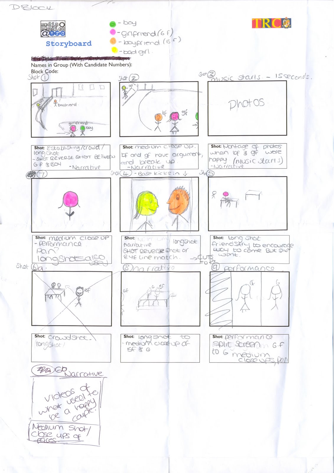
Characters need to include 2 girls and one boy.
One girl will play the girlfriend, the other will be the ‘bad girl, and the boy will play the boyfriend. The girls will be in both the narrative and performance. Costumes will be casual in the narrative for example jeans and a t-shirt whereas in the performance the costumes will be more dressed up for example fishnet tights, denim skirt and a jacket. Both of the girls will be dressed in different colours to show contrast.
- Style notes
To choose our final idea we came up with 3 ideas, presented these to a group and let them choose what they thought would be good. Using our audience feedback we chose the best suited idea. Our video narrative will be set in college and a house setting, and our performance will be set in a studio looking set. We chose these locations as we feel they are best suited to what we are doing. The camera angles we intend to use are establishing shots, close ups, medium close ups, crowd shots and long shots. No digetic sound will be used in our video only the sound of the song. Any sounds made will be edited out so only the sound track can be heard. Mise-en-scene will be natural surroundings in order to create the narrative effect we are going for.
- Recce
For our video health and safety isn’t really an issue, although there are some problems that may occur. For example, when filming our performance side if we use a backdrop this could fall and cause injury. In each of our locations there will be risks for example if we film on the road at the front of college we need to make sure the road is clear and there are no cars that could interrupt filming as well as us and the cast being safe. When filming inside we will need to make sure that there are no loose wires etc.
- Storyboard Considerations
Our planning will take place in every lesson and free we have available. Our planning process will show an in depth overview of our music video. To choose our final idea we followed our audience feedback, as now we know this will be a popular video as it has already proven so. We will draw up a story board to show our ideas for each shot.


